Friends,
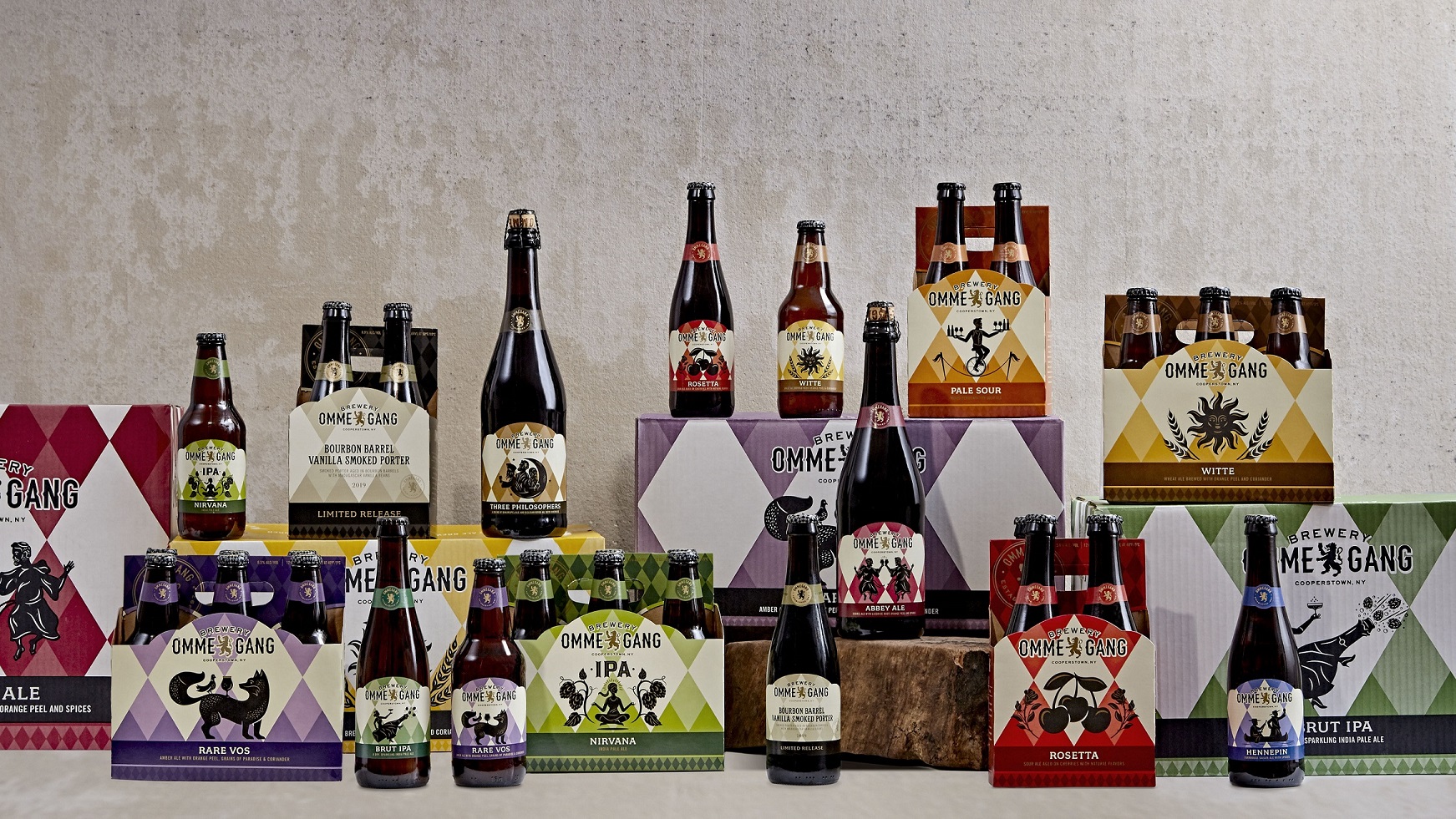
We’re excited to begin the new year with a new look. Working with CF Napa Brand Design in Napa, CA, we have thoughtfully redesigned every element of our brand to deliver packaging as elegant as our beer.
“One of our goals was to make it easier for consumers to find our beers in the increasingly crowded craft environment,” explains our president, Doug Campbell. “That’s been accomplished through consistent application of our key brand iconography, style of illustration, and color palette.”
Our year-round beers now enjoy rich, vibrant colors and a clean, uncluttered appearance. The well-known harlequin pattern serves as a backdrop for a series of bold silhouettes created by Tad Carpenter of Carpenter Collective. Each illustration is intended to evoke the story behind the beer.


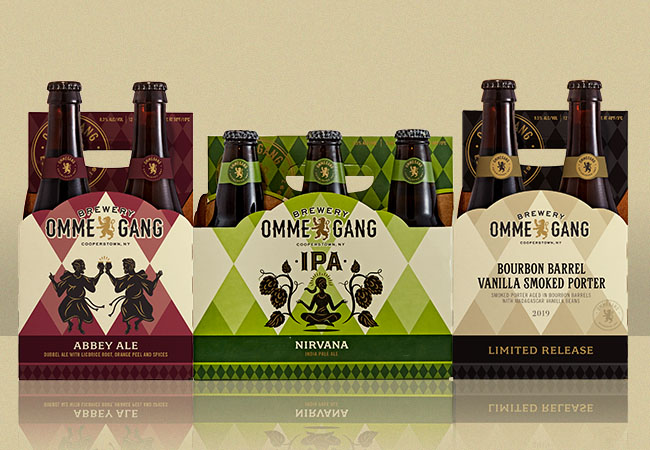


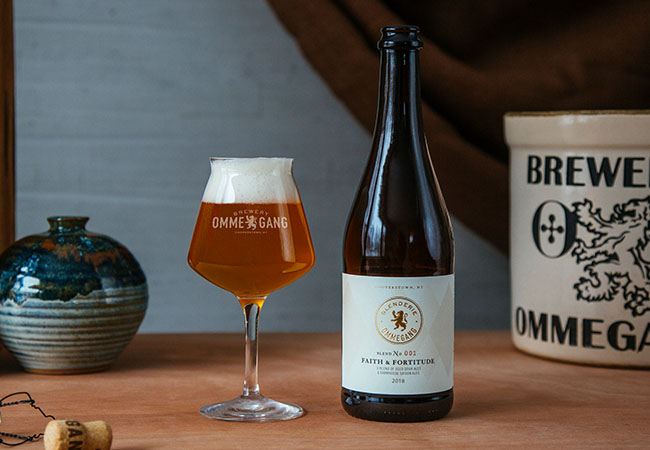
By contrast, packaging for our limited release beers employs more subtle colors and foregoes illustrations, allowing the name alone to describe what waits within. Similarly, labels for the Blenderie Ommegang series, available only at the brewery, are simple, elegant, and restrained – reminiscent of a fine wine.


Longtime fans, we hope you will find much to like in the new look, including some updated illustrations from years past and more prominent use of the harlequin design. Our brewery logo has also been refreshed, and a re-imagined tap handle is making its way to market. New labels and packaging are shipping now, and will appear on shelves in the coming months.
Cheers!